Luis F.
Graph of Diabetes treatment availability on a course to the year 2020 from 2007
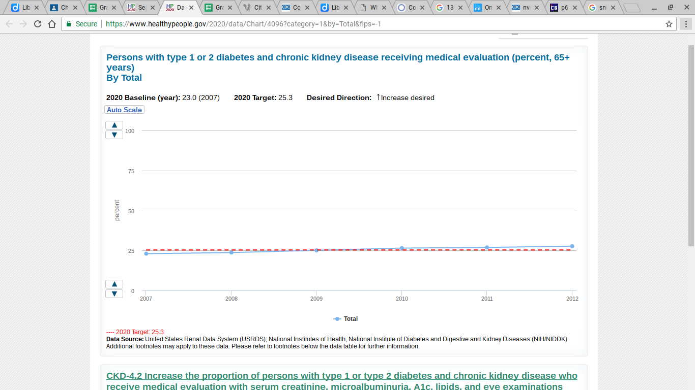
Red - Our Desired direction in treatment availability
Blue- Predicted treatment availability in the population
Blue- Predicted treatment availability in the population
This graph represents the amount of people that decide to receive treatment for kidney disease and diabetes. It may include kidney disease as well, but this represents another reason for prevalence among the U.S. population. about 25% do not receive evaluation because of their own personal decision. The target changes, though, at a very small rate but the percentage decreases. (may not be to the point, but the idea is clear).
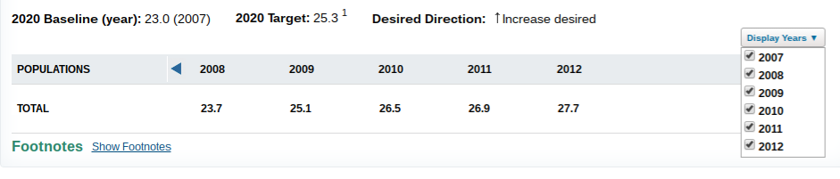
APA Citation: (n.a.), Persons with type 1 or 2 diabetes and chronic kidney disease receiving medical evaluation (percent, 65 years). (n.d.). Retrieved April 26, 2017, from https://www.healthypeople.gov/2020/data/Chart/4096?category=1&by=Total&fips=-1
